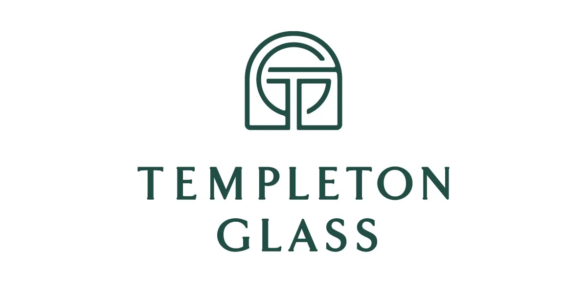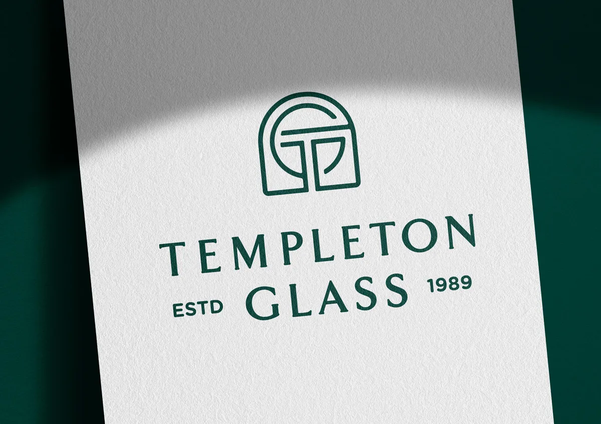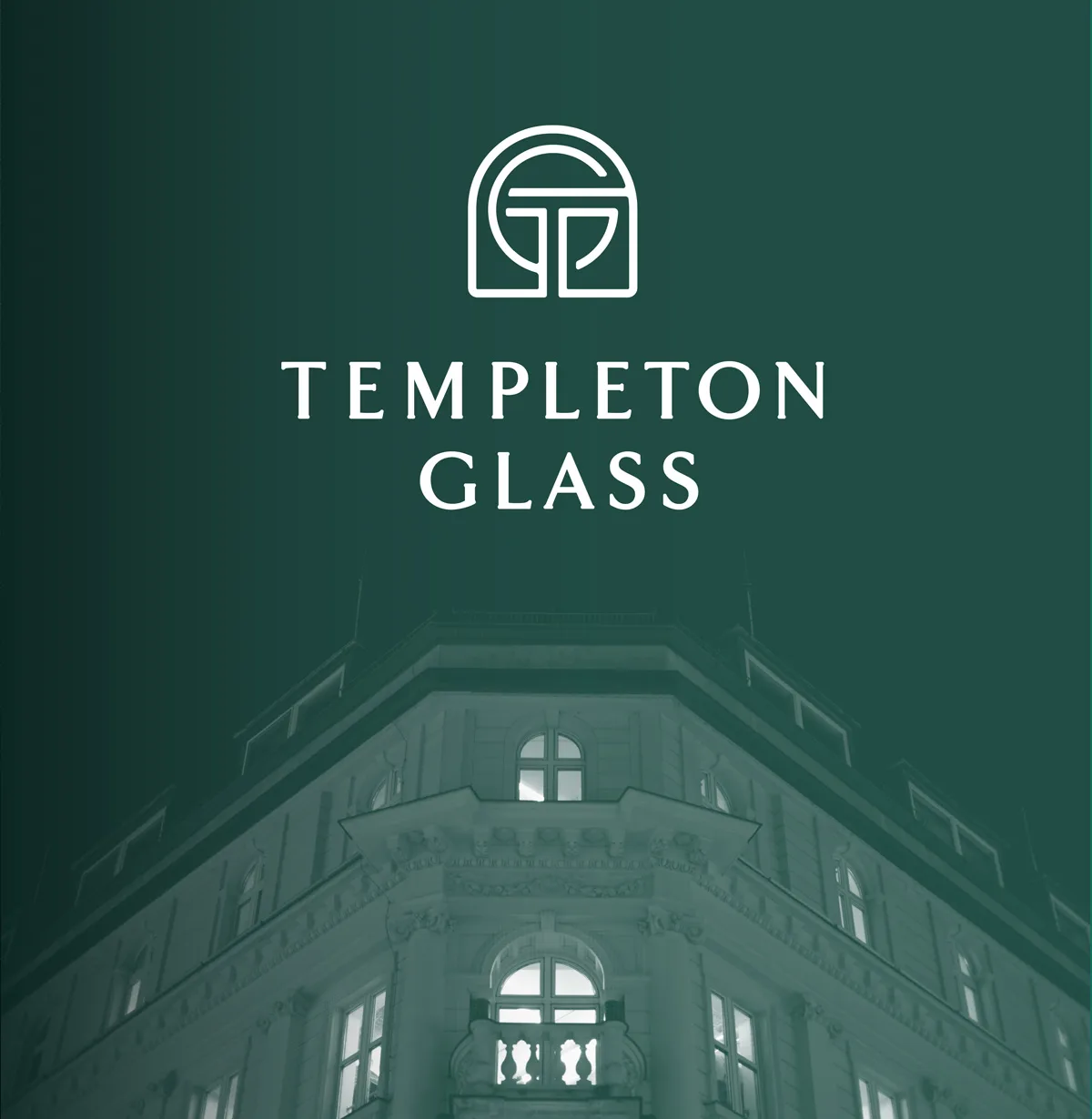

Templeton Glass
Repositioning a generational glass company as a premium architectural glass partner.
The Client
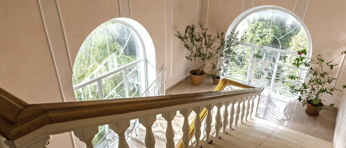
A family-owned Central Coast glass company specializing in custom residential and architectural glass solutions for high-end homeowners, builders, architects, and designers.
The Challenge
Templeton Glass had the skill, service, and craftsmanship to serve a more discerning market, but the brand was not yet making that value easy enough to perceive. The challenge was to move the company beyond the mental category of a general glass vendor and reposition it as a trusted architectural glass partner for high-end spaces. The brand needed to appeal to homeowners with taste and ambition, while also earning credibility with builders, architects, and designers who care deeply about precision, process, and design intent.
The Strategy
We reframed the value of Templeton Glass around a deeper strategic idea: glass is not merely a material that finishes a job. It is the medium that completes a vision.
For this audience, clarity means more than transparency. It means clear vision, clear communication, clear process, and clear execution. The strategy positioned Templeton Glass around the emotional and practical value of “Clarity Realized,” the moment when a design, space, or aspiration becomes tangible through precise glasswork.
The positioning identified their ideal customers and partners as people who value quality, expression, craftsmanship, and legacy. They are intentional, exacting, and willing to invest in work that reflects their standards.
The Design
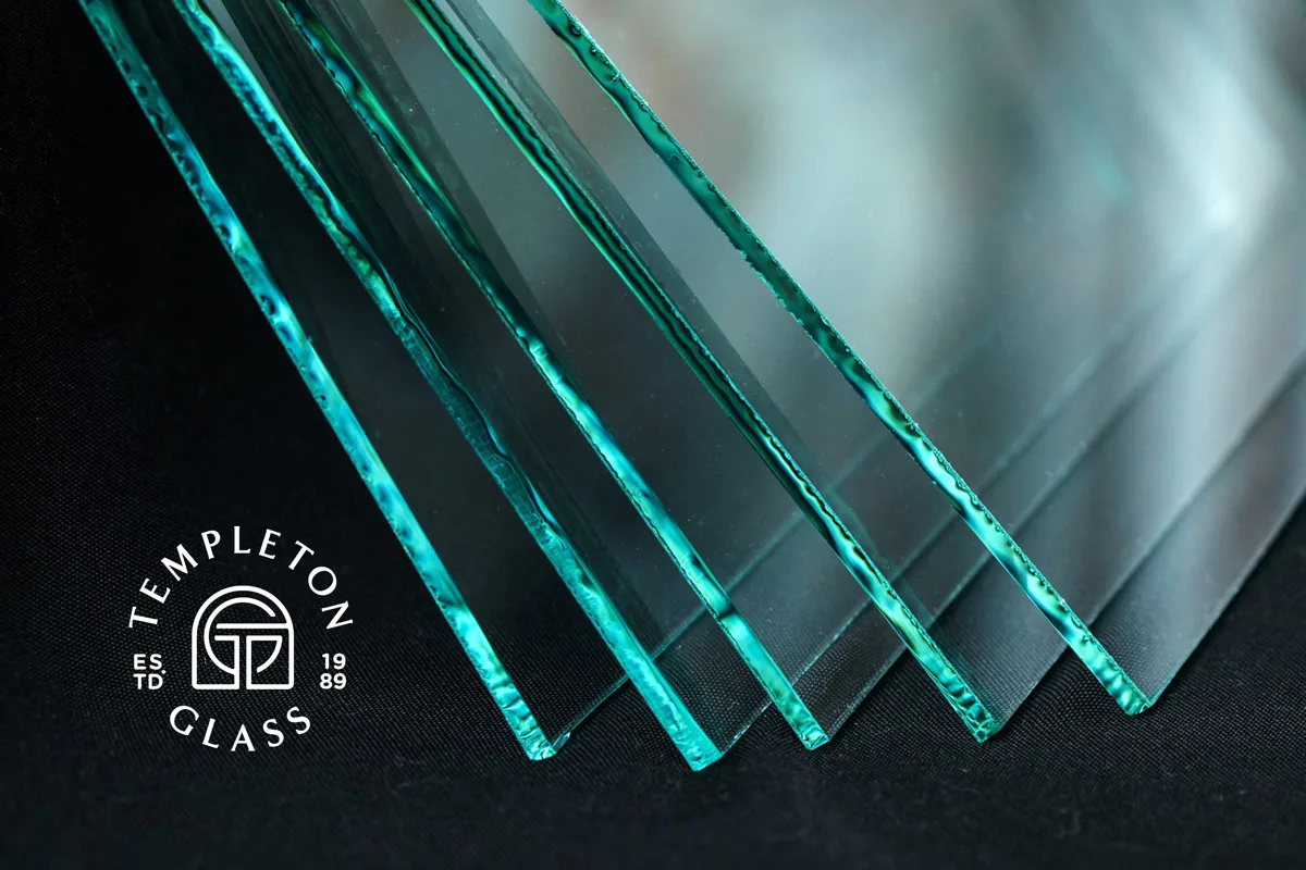
The identity needed to embody the same qualities the audience expects from the finished work: clean lines, refined details, precision, and confidence.
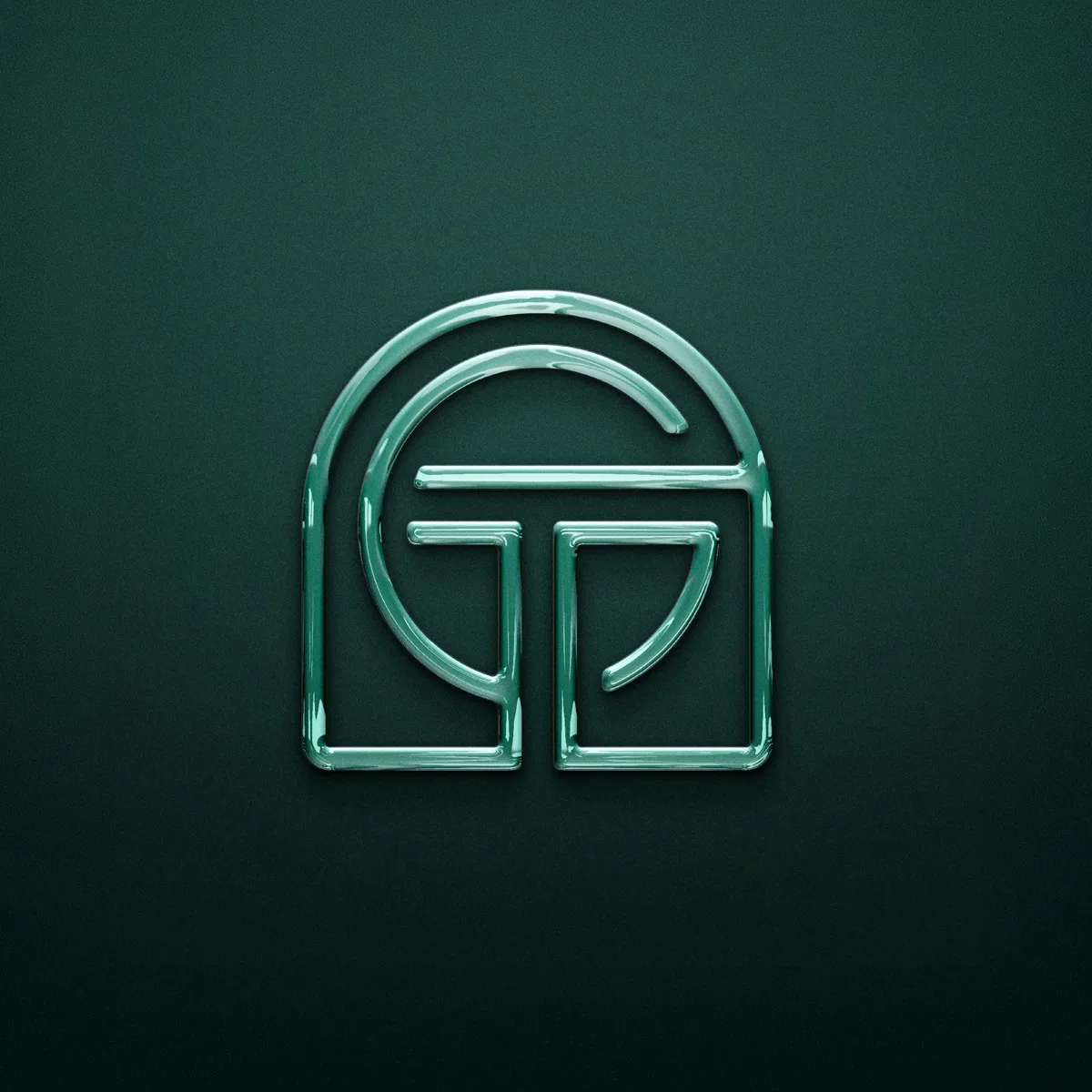
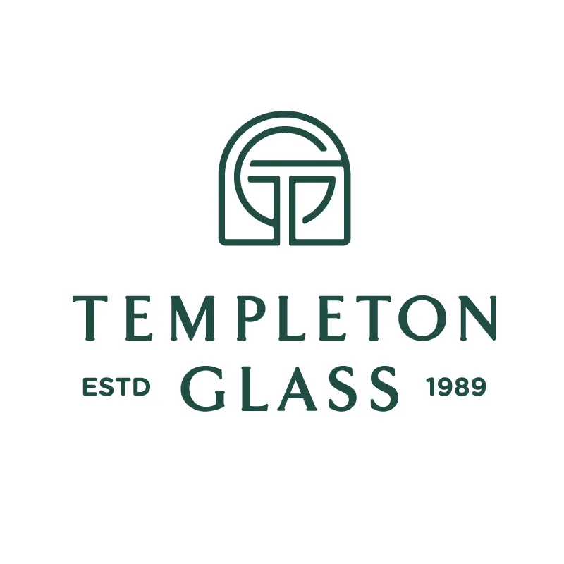
The design direction avoided visual clichés and instead focused on creating an identity that felt architectural, elevated, and enduring. The system also carried forward equity from the previous identity through the classic arch associated with timeless doors, windows, and homes. That arch became the anchoring shape for the TG monogram, representing the interwoven architecture of a window. The goal was to make Templeton Glass feel less like a vendor and more like a trusted partner in the realization of a refined space.
The Creative Solution*
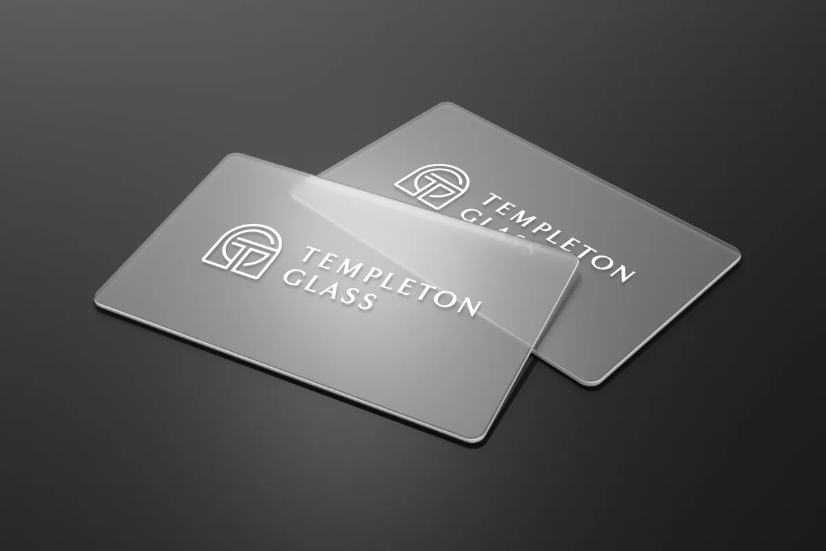
The new brand identity gave Templeton Glass a more distinctive and premium presence, aligning the company's visual expression with the craftsmanship and care behind the work.
The logo system, typography, and brand language were developed to communicate clarity, precision, and trust. Paired with the strategic concept of “Clarity Realized,” the identity helped shift the brand from a service provider into a meaningful partner in the creation of beautiful, intentional spaces.
The result is a brand that feels refined without being distant, premium without being flashy, and clear without being generic.
The Results
After 35 years of serving the Central Coast, Templeton Glass now has a brand identity and positioning system that better reflects the caliber of its work and the audience it is meant to serve.
The rebrand gives the company stronger footing with high-end homeowners, architects, builders, and designers by communicating the deeper value behind their work: not just installing glass, but helping complete a vision.
The identity also earned rebrand award recognition for North and South America, making Templeton Glass an award-winning example of strategic brand transformation for a specialized service business.

*Learn more why our solutions drive results.
What Improved
From vendor to design partner.
The brand moved Templeton Glass out of a general service category and into a premium, design-aware position.
Precision became visible.
The identity gave homeowners, builders, and architects clearer signals of care, process, and outcomes.
Architecture led the system.
The TG monogram, arch, typography, and visual system drew from the forms and restraint of refined spaces.
Clarity carried the brand.
“Clarity Realized” gave the brand a simple strategic idea to carry across messaging, identity, and touchpoints.